
People ask me all the time: “Is my label good?” And I totally understand why. You’ve worked hard on your product, you’ve fussed over your label design, and you want feedback and confirmation. But when it comes to labels, there are different kinds of “good.”
A “good” soap and cosmetic label has three distinct aspects which are all measured differently. A label can be good one way, but completely bad in another. Let’s break it down.
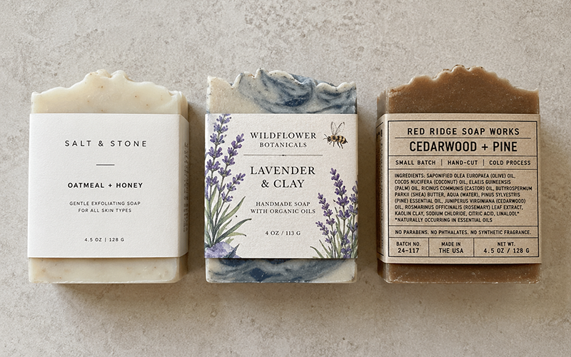
#1: Is It Compliant?
Compliance is the foundation. This one is black and white. Either your label includes all the required information in the required format, or it doesn’t. There’s no gray area, no room for opinion, and no debate. Without this part being good, nothing else matters because a non-compliant label is a serious risk. You have the possibility of pulled product, being booted out of online or in-person sales venues, insurance coverage denial, or even warning letters. In other words, not compliant = not good.
For cosmetics sold in the United States, a compliant label includes the identity of the product on the principal display panel, the net quantity of contents in both U.S. and metric units, the name and address of the responsible person, an ingredient list in descending order of predominance using correct ingredient names, and any required warnings. None of this is optional. It all has to be there, in the right place, in the right format, and in the right type size.
If you make soap that is not a cosmetic you still have all the same requirements EXCEPT that the ingredient declaration isn’t required. But — and this is important — you still have to be compliant with the rules that do apply. Simpler is not the same as optional.
The good news is that compliance is learnable. Once you understand the rules, you can apply them consistently — and after a few times, it becomes second nature.
#2: Is It Effective?
Once you know your label is compliant, the next question is: will it sell the product?
This is the marketing side of labeling — and it’s just as important as the legal side. Customers don’t read labels the way you do. They glance. They scan. In a few seconds, your label needs to tell them what this product is, what it does for them, and why they should choose it over the one sitting right next to it.
An effective label is readable, clearly identifies the product, speaks to your specific customer, and communicates your key selling point. A label targeting 20-something women who love natural skincare looks very different from one targeting 60-something men who want to simplify their routine. Neither is wrong — but they’re not interchangeable.
Here’s the key thing to remember: effectiveness is ultimately measured in sales. Not compliments. Not “I love that!” from people browsing your booth (or other makers). Not likes on Instagram. In actual cash changing hands. Pay attention to what’s actually moving versus what’s just getting admired. If your product is selling when people see the label, that’s a good label.
#3: Is It Aesthetically Pleasing?
Here’s where I want to be really clear: aesthetics are opinion. Full stop.
Colors, fonts, graphic design, illustrations, photography — these are all forms of art, and like all art, there is no objective standard. What one person finds beautiful, another finds busy. What one person finds elegant, another finds boring. That’s not a flaw in the system — that’s just the nature of creative work.
This is why it’s so important to be careful about who you let weigh in on your label aesthetics. When you show your label to friends, family, or random people on social media, you’re essentially inviting art critics into your design process. And their opinions — however well-intentioned — may have nothing to do with what actually works for your brand and your customers.
Useful feedback comes from people in your target market — people who would actually buy your product. Noise comes from everyone else, including the people who love you most. Your husband may hate the color pink. Your best friend may prefer minimalist design. Unless they’re your ideal customer, their aesthetic opinions are not useful data points.
The final arbiter of your label aesthetics should be you. It’s your brand. It’s your business. You’re the one who has to look at that label every day, post it on social media, hand it to customers, and feel proud of what you’ve made.
Final Thoughts
The next time you wonder if your label is “good,” you can run down the list:
- Is it compliant with all applicable regulations? (This one is non-negotiable.)
- Is it effective, communicating clearly to your customers and giving them a reason to buy? (This one is measurable.)
- Is it aesthetically pleasing to you, and to your target customer? (This one is personal, and that’s okay.)
Don’t let a chorus of art critics talk you into endless revisions that move you away from what works. Know the rules, know your customer, trust your own taste, and make something you’re proud of.
That’s a good label.
Leave a Reply
You must be logged in to post a comment. Log in or create a free account.