
When it comes to designing and building the label for your soap or cosmetic, there’s more to it than just the regulations. Of course, you need to make sure that you have all the required infomration on your label and that you haven’t said things you shouldn’t. However, the art and the design are important!
It is the art and design that first catch your dream customer’s eye. From there, it is the required information (along with your unique presentation and information) that moves the consumer to buy.
There are a number of different components that go into the artistic presentation and the design of a label. In this article I’m discussing fonts.
Basic Fonts
Every computer comes with a set of basic fonts installed. Macs come with their fonts; Windows PCs come with their fonts. Some fonts have become so universal they are seen everywhere, such as Arial, Times New Roman, and Helvetica.
While the basic fonts that come with a computer can certainly be used on a product label, since everyone has them available they tend to be seen as more utilitarian or generic. That “generic” perception can transfer to your product.
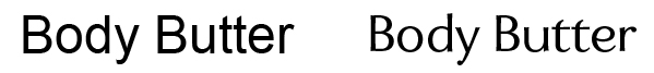
Consider the difference between simple san-serif fonts Arial (left) and Enzia (right).
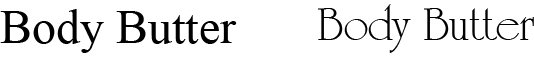
Or the difference between serif fonts Times New Roman (left) and Occidental (right):
Design Fonts
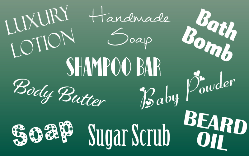
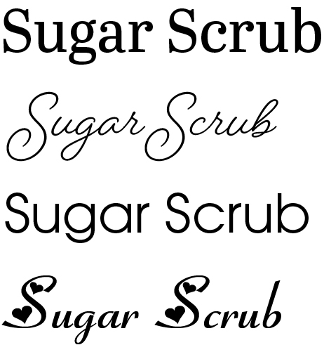
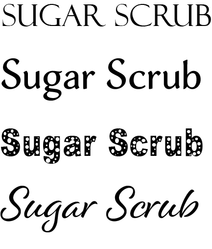
Design fonts can be used to communicate different feelings for your products, or be intended to attract a particular type of consumer. There is a wide array of possible fonts to use. For example:
Colors and other design elements will also help to portray the look and feel you are going for to attract your perfect customer.
Careful matching of your design font to your intended perfect customer is important. Kids don’t respond to the simple, classic elegant luxe look, nor do guys looking for beard oil tend to gravitate to pink hearts and flowers. Know who you are talking to and pick a font that will appeal!
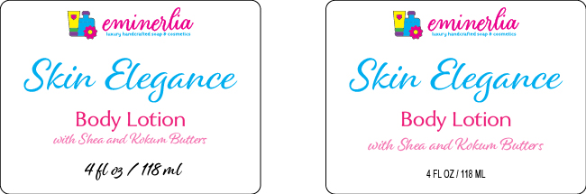
Utilitarian Fonts for Net Contents and Ingredients
Using your “design font” for the required information (net contents and ingredients) tends to pull them into your design. In addition, design fonts often have swooshes, swirls, serifs or other elements that make the font proportions different, resulting in a larger font being needed for your required information.
On the other hand, basic utilitarian fonts, such as Arial (Windows) or Helvetica (Mac) are really good to use for required information. Not only are they clear and easy to read at the minimum required size, they tend to become separate from and invisible to the graphic design and can often provide extra space.
A basic utilitarian sans-serif font does well to convey information, when displayed in all caps and in a condensed version. That can take up much less room when it comes to the ingredient declaration. Compare these ingredient declarations in different fonts. Each font measures the exact same size based on the legal requirements for measuring text.1
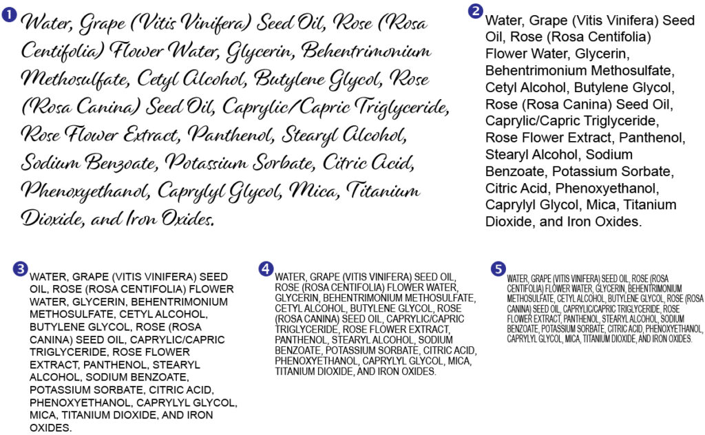
- The “design” font, Alisha Regular – 40 pt font in order to have the lower case “o” be large enough, with default line spacing.
- Utilitarian font (Arial) – 24 pt font for the lower “case”o” to be large enough; default line spacing
- Arial – 18 pt font, all caps, default line spacing
- Arial Narrow – 18 pt font, all caps, reduced line spacing (18 pt)
- Arial Narrow, additionally condensed , reduced line spacing (18 pt)
Sources of Fonts
Obviously you have the fonts that are on your computer. Or if you are working with a graphic designer, you will have the fonts available to them.
If you use an online layout program or service, such as Canva, you will have the fonts available there. In some cases, there may be more fonts available in the paid version.
Label companies that have online graphic layout capabilities for submitting your label will also have fonts. These will most likely be pretty generic and limited.
Adobe Creative Cloud, a monthly subscription service that provides all the Adobe products, includes access to Adobe Fonts. They have many unique and higher end fonts. The subscription is about $60 per month, but you also get Photoshop and Adobe Illustrator (as well as all the other Adobe software products). I’ve been using Illustrator for labels for over 20 years and have found it the absolute best for doing graphic layout work. It has a learning curve for sure, but you can do just about anything between Illustrator and Photoshop.
Finally, there are online font “stores” where you can purchase a zillion different fonts. Prices range from a few dollars for a single font, $20 and up (can be WAY up) for a font family (which includes all the available variations of a font, such as italic, bold, condensed, etc.). Personally, when I’m looking for a font that I can’t find at Adobe, I go to myfonts.com, but there are plenty of other places online to get them.
As a caution, be wary of “free” fonts online. Fonts can be loaded with malware, so be sure you use a reputable site for free fonts. Also, fonts are covered by copyright. In order to use them, you need to have a license. When you get them from a reliable source, you can check the license and know it’s okay. Shady “free stuff” sites sometime hijack the fonts, so you could end up illegally using a font.
Finally, if you are planning to use a purchased or downloaded font in a logo or some business property that you want to trademark, keep in mind that you may need a different license from the font copyright holder to do so. Be sure to check the license for the font you want to use before you invest a lot of time and money using it for something to be trademarked.
- The minimum size is determined by the lower case “o” for the upper and lower case or by the height of an uppercase letter when all uppercase is used. ↩︎

Leave a Reply