
When it comes to cosmetics, label design and packaging aren’t just about holding the product—it’s about telling a story before the customer even opens the box or unscrews the cap. The colors (and fonts) you choose for your containers, labels, lids, bags, and boxes set the stage for how your brand is perceived. Colors can influence buying decisions and even communicate what your product promises to deliver.
Let’s explore how color works in label design and packaging—and how you can use it strategically to make your cosmetics stand out.
The Psychology of Color in Packaging
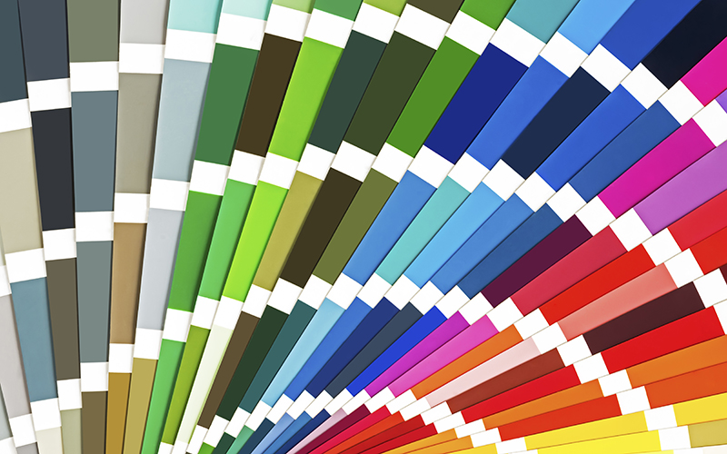
On the shelf, the color of your label and packaging is often the first thing a customer notices. If it attracts them, then they are more likely to buy – or at least pick up the product to learn more. If the colors clash or are unpleasant to the consumer, they will likely pass by without a second glance. While all things have exceptions, in cosmetics, certain colors carry fairly well-established associations.
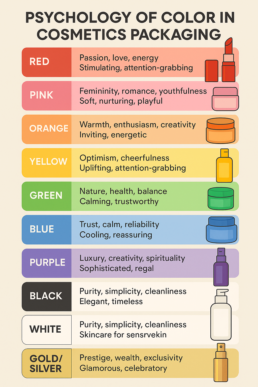
Keep in mind, that it’s not just the LABEL, it’s also the container itself. A black and gold jar conveys a different message than a generic white jar and lid, and the presentation and font play a definite part.
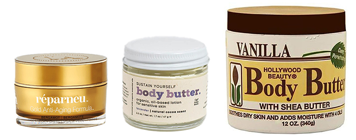
Selling at (l to r) $70/oz, $10/oz, and $0.67/oz
Think of your packaging color as a silent promise of what’s inside—one that should align with your product’s benefits and your brand identity.
Cultural & Demographic Considerations
Color choices should also consider the preferences and cultural contexts of your ideal customer. Knowing who your perfect customer is will help greatly when picking colors. While often overlooked or skipped in haste, defining your ideal customer should be a first step – before designing anything!
Age Appeal
In this time and place, talking about age may be socially “incorrect.” However, it is a necessary consideration when designing your labels, packaging and marketing.
Younger (kids and tweens) tend to gravitate to primary colors. Saturated and rich colors appeal to younger buyers who respond to fun and energetic visuals. Muted colors and sophisticated palettes resonate with mature audiences who prefer understated elegance. So while “green” may convey natural, healthy, or environmentally friendly, the type of green could appeal differently to different ages and demographics.

Cultural Meaning
In addition to age, different cultures attach unique meanings to colors.
For example, white symbolizes purity in many Western markets but can represent mourning in some Asian countries. Similarly, red can be considered lucky and prosperous in some regions but aggressive or alarming in others.
Rainbow colors, which were previously solidly in the realm of children’s products, now have a completely different cultural meaning.
As an aside, cultural meaning can also apply to words. Consider the Chevy Nova, which sold okay in the US, but did terribly in Spanish-speaking countries. Why? “No va” translates to “doesn’t go” … not a good positioning strategy for a car!
Color Harmony on Labels and Containers
Beyond individual colors, the way you combine them can determine whether your line feels premium or budget-friendly, and whether it has a “put together” look.
In the color sphere, there are standard ways to mix colors. The most common are the following, each with an example based on mint green:

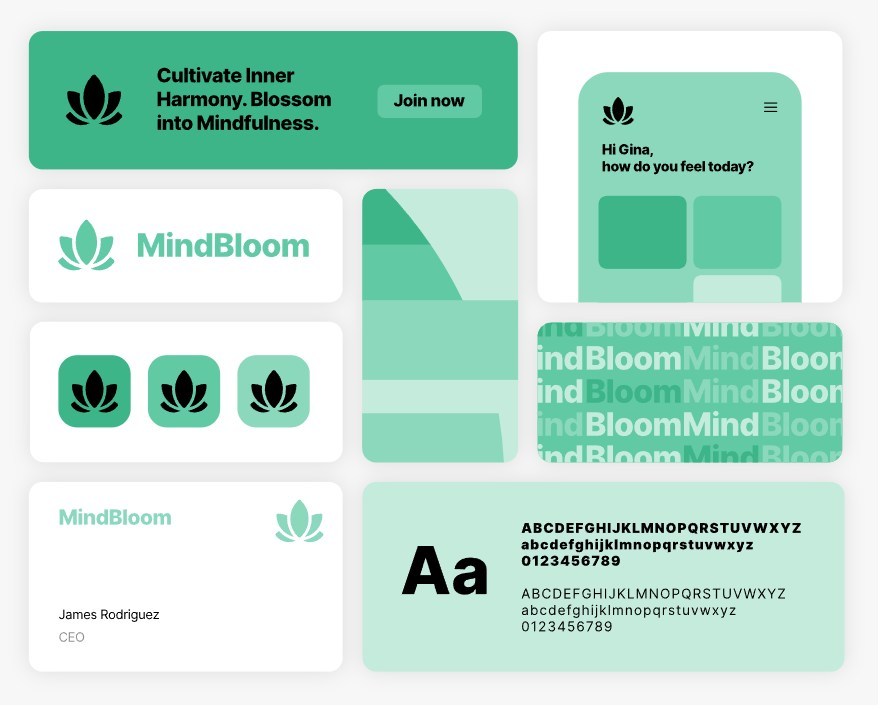
Monochromatic (variations of one hue) → This approach uses different tints (adding white, to make the color lighter) and shades (adding black to make the color darker) of the same color for a refined, unified appearance. It works beautifully for luxury skincare lines where elegance and simplicity are key.

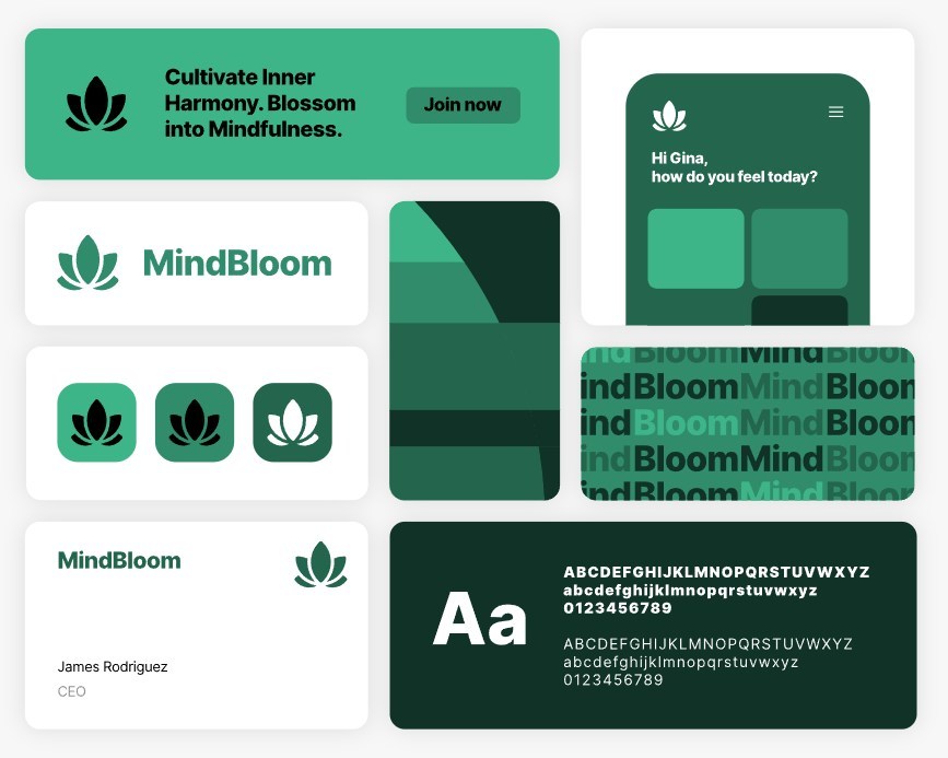
Analogous (neighboring colors) → Colors that sit next to each other on the wheel (like blue, teal, and green) create a soothing, harmonious effect. This style is ideal for spa-inspired or nature-focused packaging.


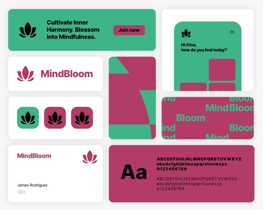
Complementary (opposite colors) → Using colors that contrast (like blue and orange) creates visual energy and helps important details—such as product names or content you want to emphasize—pop off the label.

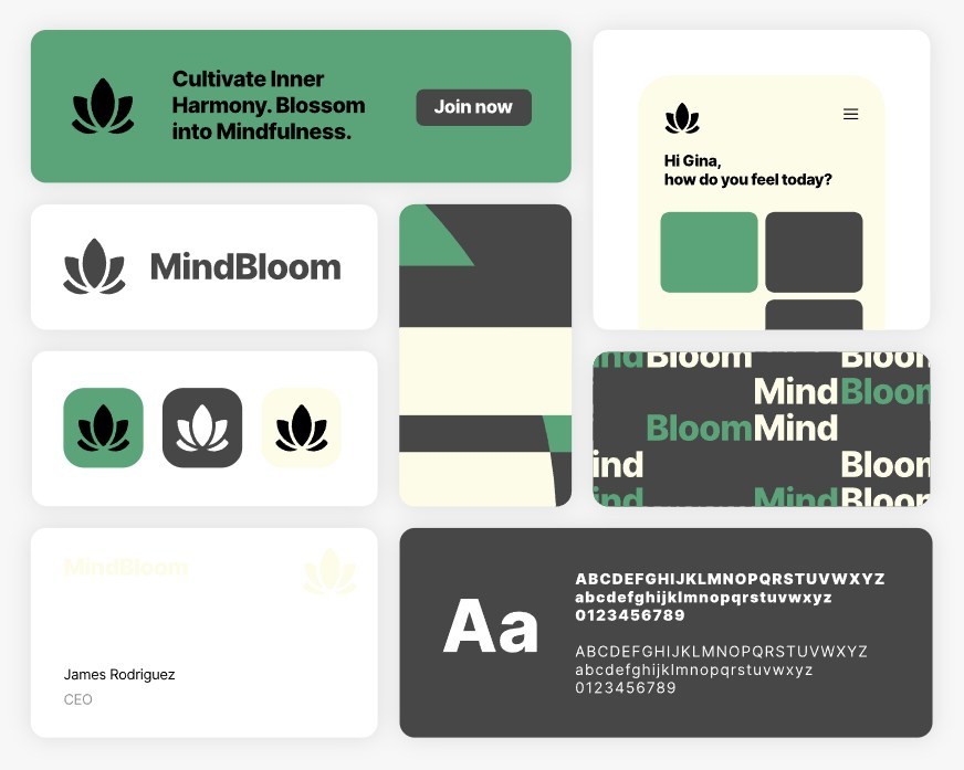
Neutral + Accent → A clean base (white, cream, matte black) allows a bold accent color to shine, making product benefits or key selling points easy to spot.

Trends
Incorporating seasonal or trending colors like Pantone’s Color of the Year for limited edition products can keep your line fresh and relevant without requiring a full rebrand. With some forethought, it can be done without breaking your overall branding.
Accessiblity Issues
In addition to what YOU (or your dream customer) see as the perfect appealing and attractive color combination, there are also some accessibility considerations.
Colorblindness
If you’ve ever wondered why some men just don’t “get” the color thing, it could be because about 8% of men (1 out of 12) have some sort of color blindness. Most commonly, it is red-green (they look at red and see green, and vice versa) but there are other types of color blindness as well. If you are making men’s products, then it would be wise to stick to the colors that most men can see correctly.
(Okay, women can abe colorblind as well, but it’s just not as common.)
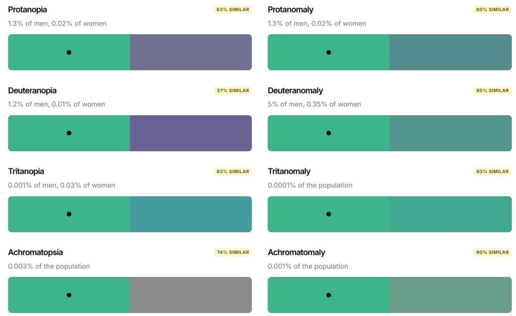
When picking your colors, check them for how others might perceive them. Coloring for Colorblindness has an interactive checker you can use. Some palette generators, such as coolors, have blindness simulators as part of the information for the colors you select.
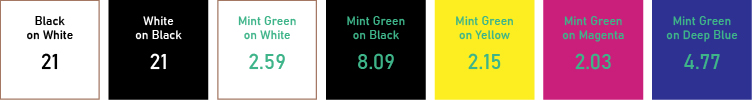
Color Contrast
Accessibility standards rate colors based on their contrast (text to background color). The standards give a numerical rating to a color/background combination. Minimum acceptable contrast is 4.5:1 for normal text. A contrast ratio of 7:1 is required for enhanced contrast. You can find a pretty good and easy-to-use color contrast checker at Accessible Web. If you are using coolors, it also has a good color contrast checker.
Tips for Using Colors for Packaging & Labeling Success
- Create and use a standardized color palette. Use the colors in it to keep your brand and marketing consistent. Don’t go off selecting new colors every time you need to make a new label, marketing piece, sign, or web page. If you have a carefully curated palette for your business, labels, and marketing, you can adapt the colors within it to fit your needs. A color palette generator can be of great assistance … I recommend1 coolors because it will give you all the information you need (I got the pro version in order to create the graphics for this post).
- Know your ideal customer. Create a color pallet that will appeal to that customer. Make sure you are within the demographics and culture of that person.
- Match emotion to purpose. If your product is meant to soothe, pick colors that feel calming; if it’s meant to energize, opt for colors that convey vitality. The emotion your packaging evokes should match the experience inside.
- Prioritize readability. No matter how beautiful the design, it must be functional. Ensure your text has enough contrast with the background for ingredient lists, warnings, and directions to be easy to read and meet regulatory requirements.
- Consider color coding. Assign specific colors within your palette to certain fragrances, formulas, or product lines so customers can quickly recognize them at a glance. Even a wide range of colors can be made to feel consistent and within your brand if they are all in a complementary hue/tint/shade. For example, all pastels or all primary colors (depending on your basic initial palette).
- Test before launch. Your perception of a color may differ from your customer’s. Gather feedback from your target audience to see how they respond to your packaging. Even small adjustments in shade or saturation can improve shelf impact and appeal.
- KEEP RECORDS! Every color has specific ways it can be identified so it is consistent. Keep a record of your selected colors, and their identifying numbers. The most important are HEX or RGB for website colors and CMYK for printed materials (such as labels).
Final Thought
Color isn’t just a design element—it’s a strategic tool. By understanding the emotional associations and using color harmony intentionally, you can make your cosmetic packaging do more than hold your product. You can make it connect, communicate, and convert.
- Full disclosure, when I signed up I was given the option to be an affliliate. So if you sign up using my link, I make a weensy little commission. ↩︎
Leave a Reply
You must be logged in to post a comment. Login/Register