
Have you ever tried to resize an image or take an image from the web and then found that it didn’t work on your label? Either it printed too big or too small, or it was fuzzy or pixelated? If you’re wondering why, the answer lies in understanding the differences between types of images and their uses.
Let’s walk through the basics so you can choose the right images for the right use and avoid those frustrating surprises.
Raster Images vs. Vector Images
Before we dive into resolution and file types, it’s important to understand that there are two main types of images: vector graphics and raster images.
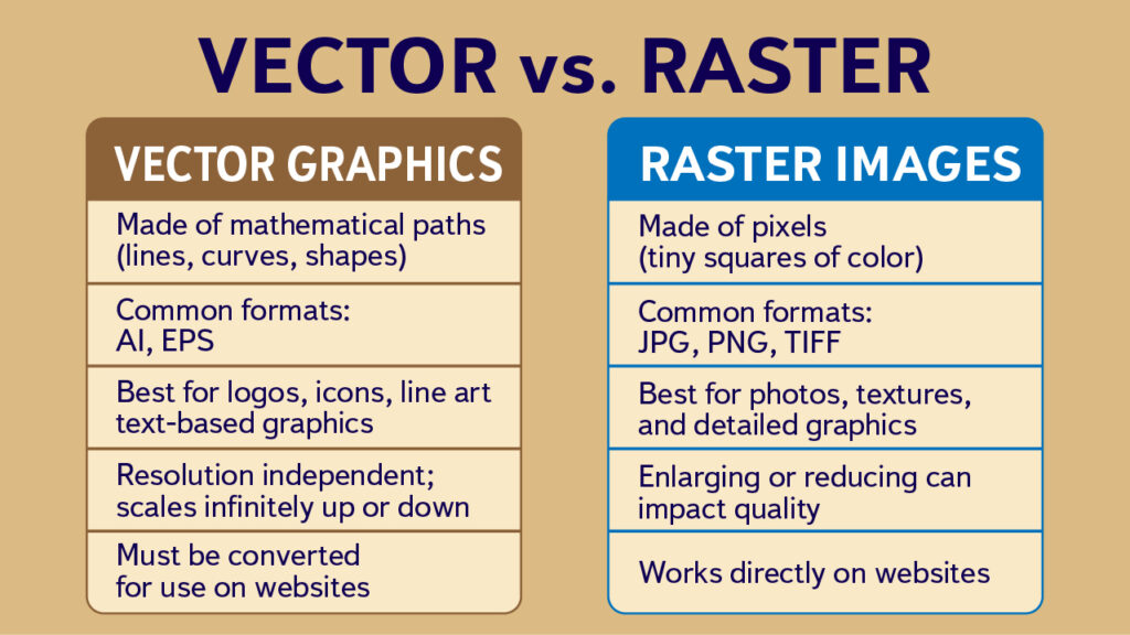
Vector Graphics
Vector graphics are created with mathematical paths and shapes (lines, curves, fills). Instead of pixels, they’re based on formulas. The file format (type) for vector graphics depends on the program that created the graphic. Most common are AI (from Adobe Illustrator) and EPS.
- Benefits: Can be resized infinitely without losing quality. Perfect for logos, icons, and graphics with clean lines. They can also be limited to specific colors or reduced to black and white.
- Drawbacks: Not suitable for photos or highly detailed, shaded images. They also don’t work directly for web display (they’re intended for print).
Raster Images
Raster images are made up of tiny squares of color called pixels. Digital photos and most web graphics are raster-based. Common raster formats include JPG, PNG, and TIFF.
- Benefits: Great for photographs and detailed, complex images with lots of color variation.
- Drawbacks: They have a fixed resolution based on the number of pixels. If you enlarge them too much, they become blurry or pixelated.
Designs for Labels
Label designs are best done using vector graphics and files. When you use a vector graphic, you get:
- Infinite scalability: A vector logo looks perfect on a business card and equally perfect on a billboard. No pixelation. If you use the same basic design for a series for labels on different size products, you can maintain perfect clarity regardless of the size.
- Flexible color use: They can be converted easily into single-color, black-and-white, or spot-color versions for specialty printing. If you go with professional printing but want to save on the cost, you could adapt a vector graphic to only one or two or three colors. Alternatively, if you wanted to add pizzazz (and some extra cost) you could use gold or silver metalic for some parts.
- Scalable fonts: Fonts can be converted to vector graphics. As such, they will scale up or down easily along with any design elements and do so without any degradation.
- Professional output: Printers prefer vector files because they can adjust them for different processes without quality loss.
The biggest downside of using vector files is that you need to have a program that will work with them. Adobe Illustrator is the gold standard, but it comes with a monthly subscription. Other alternatives are Corel Draw (either downloaded or subscription based), Affinity Designer (more affordable) and Inkscape (free, open source). Each one has their own proprietary file format, but all will export to a high-resolution pdf, which is what printers usually want.
If your label was (or is being) created by a designer, make sure that you have the rights to (and get) the vector files, and that any special fonts are included. Some designers will charge you every time you want a different size or color, so make sure you know what you are paying for at the start (and what you’ll have to pay for later).
Using Detailed Raster Images
If you want to use a detailed raster image on your label, keep in mind that the quality of the final printing of your label will be based on the quality of the image — and that is determined by its resolution.
Resolution is usually measured in pixels per inch (ppi) or dots per inch (dpi). When we talk about resolution, it mainly applies to raster images. (Vectors don’t rely on resolution—they’re resolution-independent.)
- For web: Resolution doesn’t matter—screens show images in raw pixels. A 600 × 400 pixel image will display at the size specified in the website code, regardless of the image’s resolution setting.1
- For print: Resolution matters a lot. Printers need enough dots of ink per inch to produce a smooth image. The standard is 300 dpi.
Here’s the catch: An image that looks beautiful on your website or your phone may only be 72 dpi. That’s fine for screens, but far too low for printing labels or packaging.
Loss of Quality
To make matters worse, raster images can lose quality each time they are changed and saved. This is especially true for JPG files. Some of the ways they can get degraded include:
- Resizing: When you enlarge a JPG, the software has to “guess” how to create new pixels, which results in blurriness or jagged edges (pixelation). Reducing the size of a JPG results in pixels being removed; it still causes image degradation, but it’s usually less noticeable.
- Compression: JPEG files use “lossy compression,” so image data is discarded when they are saved or re-saved with compression. The amount of loss depends on the quality settings chosen — high compression causes more noticeable quality loss.
- Web optimization: Many JPGs are “maximized” or optimized for the web—small file size, quick loading, lower quality. Perfect for websites, but not for printing.
What To Look For
- Resolution: Always 300 dpi or higher (for raster images).
- File type: TIFF, PNG, or high-quality JPG. For logos and line art, or items that will be printed at different sizes, vector formats (AI, EPS, PDF) are ideal.
- Size: Always larger than your final print size.
How to Check
- Open the file in an image editor (Photoshop, Canva, or even Preview for raster images; appropriate program for vector graphics).
- Check both size and resolution. For example:
- 1200 × 1200 pixels at 72 dpi = 16.6 inches on screen, but only 4 inches at 300 dpi when printed.
- 1200 × 1200 pixels at 300 dpi = 4 inches in print, sharp and usable.
- Do the math: Divide pixel dimensions by 300 to find the largest print size.
If it’s too small, the image isn’t suitable for print. Vector images skip this step because they resize without issue.
IMPORTANT NOTE: A vector graphic file can include an embedded or linked raster image. In that case, all of the caveats, warnings, and precautions apply to the resizing and editing of the raster image!
Logos
Logos deserve a special mention because they’re used everywhere—on websites, social media, packaging, business cards, and labels. Even more than labels, they need versatility so they can be adapted to the right size and coloring for the particular use. That’s only really possible with a vector graphic.
The key is to copy and modify the vector graphic and THEN export it to the format needed (for web or print).
If you have a version of the logo as a raster image (JPG or PNG) and resize that file for your particular need, you will get degradation each time, until finally the file becomes unusable.
The Bottom Line
When selecting images for your labels or other print materials, make sure you have the best image possible:
- Use vector images (AI, EPS, or converted to PDF) for labels and logos whenever possible.
- Raster images (JPG, PNG, TIFF) are pixel-based. They work for web and print, but only if resolution and size are correct. Enlarging them reduces quality.
- Vector images (AI, EPS, PDF) are resolution-independent. They’re perfect for logos and graphics that need to scale for print. They don’t work directly on websites.
Before sending anything to print, always check:
- Dimensions in pixels (for raster)
- Resolution (300 dpi minimum)
- Whether a vector file is available (best for logos and line art)
By understanding the differences and choosing the right type of image, you’ll avoid blurry labels and ensure your brand looks just as professional on the shelf as it does online.
- There are some methods to make a picture look larger or smaller on a website; but they still rely on the number of available pixels. That’s why big background pictures are sometimes fuzzy – the original image doesn’t have as many pixels as the space the website is trying to fill with it. ↩︎
Leave a Reply
You must be logged in to post a comment. Log in or create a free account.